Hello Folks!
I’m Ornellius, UX Lead at Vodafone Idea.
Welcome to episode seven of <beta> than ever, your ultimate weekly product design guide. Last time we explored the Lightning-Fast World of Quick Commerce, it’s a fun and light read on what all elements go into ensuring that groceries and more reaches you in minutes.
Today, we’re doing a deep dive into E-commerce. More specifically into the bottom and top navigation of ecommerce apps.
After analyzing 50 leading e-commerce apps (yes, I actually went through the trouble of mapping out their entire navigation structures), I’ve noticed something fascinating:
we’re witnessing the quiet death of traditional navigation paradigms.
And honestly? It’s about time.
Read till the end to get access to link on the documentation.
What’s so special about the top and bottom navigation?
These apps have invested heavily in user research and iterative testing to optimize their navigation for maximum effectiveness. By analyzing their approaches, we can uncover best practices and emerging trends that can elevate our own ecommerce experiences.
The top and bottom navigation are particularly insightful, as they represent the prime real estate for guiding users and driving key actions. Understanding how the big players use these prime navigation zones – whether it’s strategically placing conversion-focused CTAs, dynamically personalizing menu options, or striking the right balance between branding and usability – equips us with a playbook for creating intuitive, high-performing ecommerce flows.
The Status Quo Is Boring (And We All Know It)
Let’s address the elephant in the room: most e-commerce apps today are playing it criminally safe. Home, Search, Cart, Profile – rinse and repeat. Yes, it works. Yes, users understand it. But are we really innovating, or just templating our way through the decade?
Here’s what my research revealed about our current state:
1. Navigation Standardization
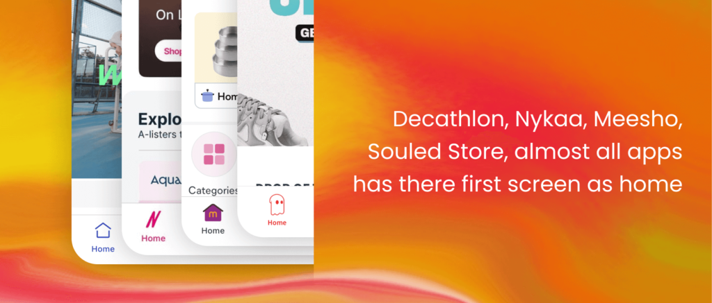
• 90% of apps still religiously follow the 5-tab bottom navigation pattern
• “Home” on bottom left, “Cart” always on right side of the screen, and “Search” on top appear consistently across most apps, indicating these are essential user journeys
2. Brand Identity Reflection
• Single-brand retailers (like Apple Store, Ikea) tend to have simpler navigation structures focused on product discovery rather than brand or category discovery.
• Multi-brand marketplaces (like Amazon, Flipkart) emphasize categories and search functionality more prominently, reflecting their broader inventory

3. Search Strategy Variation
• More sophisticated platforms offer multiple search modes (keyword + scan + voice) like Amazon
• Fashion-focused apps often include “photo search” capability, showing understanding of their users’ visual discovery preferences
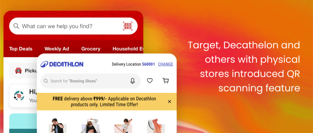
• Some brands who have physical stores have added QR scan options too to the search. Wonder why? So that users could scan the products in person while at the store. Let’s say they don’t intent on buying it while at the store, but the next time a sale happens, they’ll surely buy it via the app.
4. Personalization Emphasis
• Many apps use personalized labels like “For You” or “You (Name)” instead of generic terms like “Profile”
• This strategy helps create a more intimate, customized shopping experience

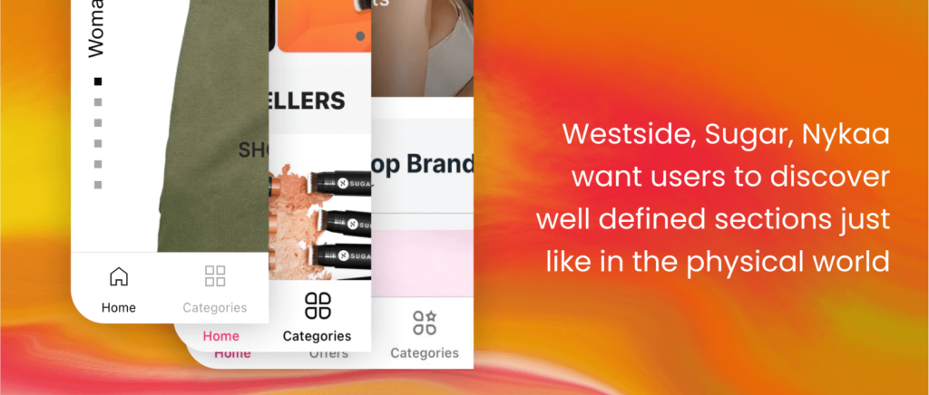
5. Category Access
• Most multi-brand retailers provide direct category access in primary navigation
• This suggests categories are a crucial entry point for product discovery
6. Social Commerce Integration
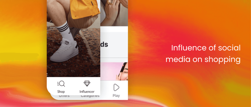
• Newer apps include social features like “Community” and “Influencer” tabs
• This reflects the growing convergence of social media and e-commerce
7. Brand focus vs Product Focus
• Most single-brand apps have their brand logo on the top navigation to help users feel a sense of connection with the brand they are shopping from
• Most ecom apps that have multi-brand products don’t display their own brand logo anywhere on top or bottom nav. Why? Because the purchase of the products through their marketplace is more important. The idea is that customer’s discovery of the said ecommerce app will happen through different mediums of advertising, but once a user is here let’s show them products and brand they would like to purchase.
As I dug deeper into my research, I uncovered something even more fascinating
Cultural Signatures Across The World
Navigation patterns are becoming true cultural signatures. Let’s take a closer look:
• Western apps (Apple Store, Best Buy) = Minimalist, function-focused
• Asian apps (Gojek, Uniqlo, Zalando) = Feature-rich integration
• Indian apps (Flipkart, Tata CLiQ, Paytm Mall) = Hybrid approach with emphasis on deals and social proof
This isn’t just a design choice – it’s a reflection of how different societies approach the art of digital commerce. In India, for instance, we love our discounts and community validation, which is why ‘Offers’ often takes center stage.
The Premium Paradox: Less is More
Premium brands like Apple and Nike SNKRS actually offer fewer navigation options. Less is literally more expensive! 🤯 But why?
My theory? Premium brands are selling more than just products – they’re selling confidence. When you know exactly what you want, you need fewer navigation options. It’s the digital equivalent of a boutique vs. a supermarket.
Future Forward: The AI Navigation Revolution
Now, let’s talk about the future. While these might be extremely farfetched. I’m excited to share my vision for the next frontier of e-commerce navigation:
1) Contextual Navigation
• AI that learns your shopping patterns and reorganizes navigation based on time, location, and behavior
• Now I know, some of you will say, Ornellius, if you change the navigation, won’t the user get confused? Well if done smartly, this could work wonders.
• Example: Depending on the user, your bottom nav showing ‘Groceries’ in the morning and ‘Entertainment’ at night.
• Push the frontier of personalisation, different regions could have a different navigation specific to their subcultural context.
2) Emotional Response Integration
• Navigation that adapts to your emotional state through facial recognition or typing patterns. Less functional, more emotional.
• Stressed? The app automatically simplifies its navigation
• Browsing leisurely? It might suggest exploration-focused paths
3) Social Commerce Navigation
• Navigation that morphs based on your social connections’ real-time activities
• Your friend is building a wishlist? A collaborative shopping tab appears
• Your friends start buying a particular brand of products, you start seeing the same
Wrapping up
I promised you earlier, here’s a link to a sheet with the bottom and top navigation of the 50 apps
So the next time you are working on an e-commerce app, this sheet will help you gauge where you really stand when it comes to brand strategy and brand positioning which will later dictate your user experience.
The future of e-commerce navigation won’t be measured by conversion rates alone, but by how seamlessly it integrates into our daily lives. The next time you tap that bottom navigation bar, remember: you’re not just moving through an app – you’re participating in the evolution of human-computer interaction. And trust me, it’s only getting <beta>.
