Hello Folks!
I’m Ornellius, UX Lead at Vodafone Idea.
Welcome to episode four of <beta> than ever, your ultimate weekly product design guide. Last time we explored the “The future of tech through the lense of product design”
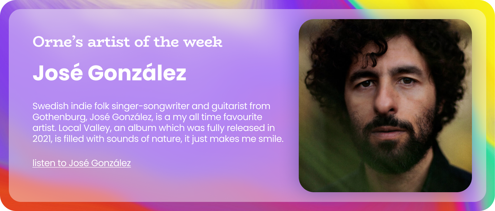
Today, we’re painting with a different brush – quite literally. We’re going to explore how color psychology can level up your design game, whether you’re crafting the next big app or preparing a crucial pitch deck. Colors speak louder than words. This episode holds multiple pictures and references to help you visualise the importance of color. And lastly, the end has a cool song recommendation.
My Aha moment with color
n 2019 I was a visiting faculty member teaching Advertising Design to third year mass media students. One one particular day I took a box of 20 different paints and a few coasters. My brief to the class was- Let’s make some art, pick ONLY 3 paints that you are FEELING today, drop it on the canvas, move it around. Let gravity be your partner in this paint exercise.
The results of this exercise were phenomenal! The entire class learnt multiple perspectives of how different people perceived color. Moreover these insight helped them make better decisions while creating their brands.
The Big Picture: Color Psychology 101
In a world where the average person makes a judgment about a product in just 90 seconds, and up to 90% of that assessment is based on color alone (yes, really!), understanding color psychology isn’t just nice-to-have – it’s ESSENTIAL.
Before we dive into the practical stuff, let’s get our fundamentals straight. Color psychology in design isn’t about picking your favorite hues or following trends – it’s about understanding the subtle language that colors speak to our subconscious mind. Think of colors as the emotional soundtrack to your design – they’re playing in the background, but they’re dramatically influencing how people feel.
While at a very large level we have warm colors (ranging from red-orange-yellow) and cool colors (ranging from green-blue-purple), the way people feel about them varies drastically. Let’s take a look at a few colors and how the world around us perceives it.
The Not-So-Blue Story of Facebook
Mark Zuckerberg chose blue for Facebook not just because he’s colorblind to red and green (true story!), but because blue represents trust, stability, and depth. It’s like the digital equivalent of a firm handshake. No wonder many tech companies, from IBM to LinkedIn, sail in these blue waters.

Red: The FOMO Fuel
Netflix’s red isn’t just pretty – it’s strategic. Red increases heart rate and creates urgency, perfect for a platform that wants you to binge-watch “just one more episode.” YouTube’s red play button? It’s practically screaming “Click me!” And let’s not forget those notification badges on your phone. They’re red because your brain is hardwired to notice and respond to this color – it’s the same instinct that made our ancestors pay attention to red berries and blood.

The Green Light of Progress
Spotify’s signature green isn’t just a way to stand out from the sea of blue apps – it represents growth, harmony, and forward movement. When you see that green progress bar moving across your screen during a song, it’s subtly telling your brain “we’re going places!” The same psychology works for Duolingo’s mascot: that green owl represents growth and learning (even when it’s passive-aggressively reminding you about your missed Spanish lessons).

The Luxury of Black
Ever notice how high-end products often come in black packaging? Apple’s “Space Gray” products, Nike’s sleek black boxes, or Cred’s entire app and branding – black screams sophistication. It’s the little black dress of the product world. But here’s the catch: too much black can be overwhelming. That’s why Instagram’s dark mode still keeps those colorful elements popping – it’s like stars in the night sky.

The Happy Meal Effect
McDonald’s famous golden arches combined with red create a powerful psychological cocktail. The yellow triggers happiness and optimism (and, let’s be honest, hunger), while the red creates excitement and urgency. It’s basically telling your brain “Be happy! Eat now!” No wonder kids go crazy for it. Yellow as such is a happy color. Makes you think of the sunshine, positive vibes and mindful happy days.

White Space: The Silent Hero
Apple’s product design teaches us that sometimes, what you don’t show is as important as what you do. Their minimalist white aesthetic isn’t just about looking clean – it’s about creating a sense of possibility. It’s like a blank canvas that says, “With this device, you can create anything.” Plus, it makes those colorful app icons pop like confetti on a snow-white background.

The Power of Purple
Have you noticed how many anti-aging cream brands use purple in their packaging? It’s not just because it looks royal – purple historically represents luxury and wisdom. Brands like Yahoo! and Twitch use purple to stand out in a sea of blue tech logos, while still maintaining that trust factor. It’s like wearing a crown in a room full of business suits.

The Gradient Game
Instagram’s logo evolution from a vintage camera icon to that vibrant purple-to-orange gradient wasn’t just about modernization. Gradients create depth and dimension, making flat designs feel more alive. It’s like a sunset in your pocket – and who doesn’t love a good sunset?

More application in the real world: The Good, The Bad, and The Brilliant
The Trust Game: Financial Apps
Look at any major fintech app – from PayPal to Wise. Notice something? Blues dominate the landscape. This isn’t coincidence. Blue builds trust and security, crucial emotions when handling people’s money. But here’s where it gets interesting: Klarna broke this pattern with their soft pink branding. Risky? Yes. Successful? Absolutely. They created a distinct identity while using a color associated with warmth and approachability – perfect for making financial services feel less intimidating to younger users.
The Energy Shift: Productivity Tools
Observe how Monday.com or even ZOHO uses multiple colors in their interface. Each project status and category has its own color, creating a visual system that helps users navigate complex information. But notice how they use muted tones – energetic enough to engage, but not so bright that they exhaust users who stare at the platform all day.
The Appetite Appeal: Food Delivery
Ever noticed how food delivery apps like Swiggy, Doordash and Zomato use red, orange and green prominently in their app? Red and orange stimulates appetite, while green subconsciously signals freshness and the fact that the food is “pure veg”. But here’s a pro tip: their success lies in how they balance these powerful colors with neutral spaces, preventing sensory overload.
Making these examples actionable while you design. Here’s how:
Start with User Emotion: Before opening your color picker, ask: “How should users feel when using this product?” Map your color choices to these emotional goals.
Consider Context: A meditation app needs different colors than a gaming app. Get to know your product better. Remember, Headspace’s orange branding works because it represents vitality without being aggressive.
Create Mood Boards: Before starting any design, create color mood boards to test how different combinations make you feel.
Test for Accessibility: Your clever color scheme means nothing if it excludes colorblind users. Tools like Stark can help here.
Study Successful Brands: Create a swipe file of effective color uses in your industry.
Brand Evolution: When refreshing a brand, don’t feel confined to category norms. Mailchimp’s yellow defied the tech-blue trend and helped them stand out.
- Color hierarchy: Brighter, eye catching colors to highlight information. Subtle colors for FYI status updates. Mute colors for repetitive units on your screen.
Some Next Level: Advanced Tips
Cultural Considerations: Remember, color meanings vary across cultures. White signifies purity in Western cultures but mourning in some Eastern ones.
Color Combinations: It’s not just about individual colors – combinations create their own psychological effects. The Instagram gradient (blue-purple-pink-orange) creates a sense of creativity and energy that a single color couldn’t achieve.
Context Switching: Consider how your colors will appear in different contexts – dark mode, print materials, various screen types.
Wrapping It Up
Color psychology isn’t about following rigid rules – it’s about understanding principles and applying them creatively to your specific context. Whether you’re designing a product, creating marketing materials, or preparing a presentation, thoughtful color choices can be the difference between good and unforgettable.
Thank you for sticking around. If you reached this far then I’m proud of you. This was a long one, but now you have enough colourful knowledge to help you take your color game to the next level.
Stay creative, stay bold, and as always, stay <beta> than ever!


