Hello Folks!
I’m Ornellius, UX Lead at Vodafone Idea.
Welcome to episode two of <beta> than ever, your ultimate weekly product design guide. We’ve got a special episode today, stick around, read till the end, I’ve added new products I’m most excited about and a new music artist of the week that I’ve been listening to on repeat.
In today’s episode we’ll cover some killer methods for turning chaotic research into actionable design gold.
Previously, we explored the 5A process to improve the quality of work as a product designer. Today’s blog is related to the first “A”, Ask. As a product designer, before hitting the screen to design, you need to ask a bunch of questions to build context on the problem at hand.
Without the ask phase you are a designer throwing darts in the dark. Hoping and praying that you hit bulls eye. The truth is that you might just end up stabbing someone instead of even coming close to the board.

Well, you might wonder: Who to ask, Why to ask, What to ask?
Potential or existing users – these are people who will use the solution you are about to design. Try to dig deep into the problem they are facing.
Facilitators – these are people who will ensure that they promote your product and ensure that users use it. Try to validate the problem and see how big it really is.
Business teams – while customers want to go to the moon, business team might not entirely see value in that as yet. See what business teams measure as success. Try to understand the north star.
Development teams – You might make insane designs, but if it can’t be developed, it is useless. Understand dev capabilities, database limitations and seek innovation opportunities. Try to understand data structures.
Analytics teams – How do you know that your solution succeeded? By knowing what the numbers looked like before you solved the problem and compare it to the post launch data. Analytics often also shares insight in whether or not the problem exists or if we were just imagining one. Try to understand the KPI to your design solution.
While you’ll find a bunch of ways to research, here are some fun tools for remote research and here are some innovative research methods to supercharge your ‘Ask’ phase.
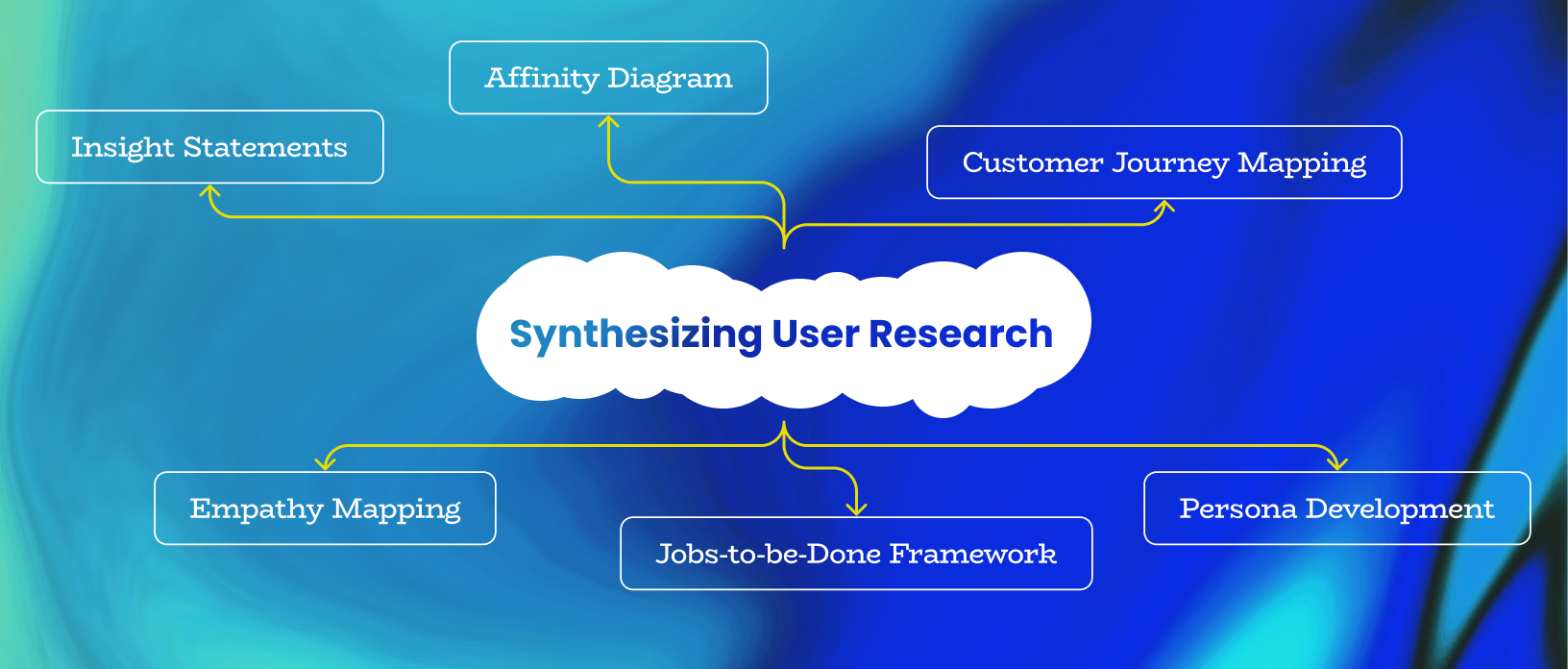
So, you’ve just wrapped up your user research, and now you’re staring at a mountain of data. Sticky notes everywhere, interview transcripts for days, and don’t even get me started on those survey responses. Feeling overwhelmed? Don’t sweat it! We’ve all been there. Let’s climb this mountain together. 🎉
1. Affinity Diagramming: The OG of Data Organization
First up, we’ve got affinity diagramming. It’s like Marie Kondo for your research data, but instead of asking if it sparks joy, you’re grouping similar ideas together.
How it works: Grab those sticky notes (or digital equivalents if you’re fancy), while reviewing your research notes or while replaying the recordings, write down key insights, and start clustering them into themes. It’s like playing matchmaker for your data points.
Real-world example: When Spotify was redesigning their home screen, they used affinity diagramming to group user feedback. They found that “mood-based listening” was a major theme, which led to the creation of their popular mood playlists. Neat, huh?
Pro tip: Make it a team sport! Get your squad together for a synthesis workshop. More brains = more insights (and more fun).
2. Customer Journey Mapping: Walk a Mile in Your User's Shoes
Next up, we’ve got customer journey mapping. It’s like plotting your user’s adventure through your product, complete with all the highs, lows, and “WTF” moments.
How it works: Create a visual representation of your user’s experience over time. Include their actions, thoughts, and feelings at each stage.
Real-world example: Airbnb used journey mapping to improve their host onboarding process. They identified pain points like “uncertainty about pricing” and “fear of property damage,” which led to features like Smart Pricing and Host Protection Insurance.
Pro tip: Use emojis to represent user emotions at each stage. It’s a fun, visual way to spot where you’re delighting users and where you’re, well, not. 😊😐😫
3. Persona Development: Meet Your (User) Match
Personas are like Tinder profiles for your target users, minus the cheesy pick-up lines (usually).
How it works: Synthesize your research into fictional characters that represent your key user groups. Include demographics, behaviors, goals, and pain points.
Real-world example: When Netflix was developing its personalization algorithm, they created detailed personas. One such persona, “Maria,” a busy mom who binge-watches shows after her kids go to bed, influenced features like autoplay and “Continue Watching” suggestions.
Pro tip: Give your personas a theme song. It’s a fun way to bring them to life and remember their key traits. (Just try to get “Maria’s” theme out of your head during your next design sprint!)
4. Jobs-to-be-Done Framework: What's Your Product's Mission?
The Jobs-to-be-Done (JTBD) framework is like figuring out why someone hired your product as their personal assistant.
How it works: Instead of focusing on user attributes, you identify the “jobs” users are trying to accomplish with your product.
Real-world example: Intercom used JTBD to revamp their customer messaging platform. They discovered that beyond just “sending messages,” users were hiring their product to “build personal relationships at scale.” This insight led to features like custom bots and targeted messaging campaigns.
Pro tip: Try framing the jobs as tweet-length statements. If you can’t explain it in 280 characters, you might need to break it down further.
5. Empathy Mapping: Feel All the Feels
Empathy mapping is like being the mind-reader your users wish you were.
How it works: Create a chart divided into sections: what users say, think, feel, and do. Fill it in based on your research findings.
Real-world example: When Headspace was refining their meditation app, they used empathy mapping to understand user mindsets. They discovered a disconnect between what users said (“I want to meditate more”) and what they did (rarely opened the app). This led to the development of shorter, more accessible meditation sessions and reminders.
Pro tip: Use different colored sticky notes for each quadrant. It’ll make your empathy map look like a beautiful data rainbow. 🌈
6. Insight Statements: Make It Snappy
Insight statements are like the movie trailers of your research findings – short, punchy, and leaving everyone wanting more.
How it works: Distill your key findings into clear, actionable statements. Usually in the format: “User X needs Y because Z.”
Real-world example: During the development of the Apple Watch, an insight statement might have been: “Active users need hands-free access to their fitness data because they can’t check their phones while working out.” This likely influenced the design of the activity rings and workout tracking features.
Pro tip: Have a competition with your team to create the most compelling insight statement. Winner gets to pick the music for the next design sprint (or gets the next round of coffee free).
Wrapping It Up: From Synthesis to Success
There you have it, folks! Six awesome methods to turn your research data into design direction. Remember, synthesis isn’t a one-size-fits-all deal. Mix and match these methods based on your project needs. And don’t forget to have fun with it – who says data analysis can’t be a party?
The key is to keep your users at the heart of the process. Whether you’re mapping their journey, creating their persona, or trying to read their minds with empathy mapping, it’s all about understanding their needs, desires, and pain points.
So go forth and synthesize! Transform that data mountain into a goldmine of insights. Your users (and your product) will thank you. And hey, if all else fails, there’s always the time-honored tradition of staring at the ceiling until inspiration strikes. But maybe try these methods first. 😉
That’s all for today. See you next week. May the force be with you.
Product news from around the world:
Meta launched Orion.
Must say, super impressed with what they have achieved. Apart from the fact that Mark looks less like a robot and very much human, the new Orion glasses seem to be insanely promising. Couple of things stand out- light weight, no extra cables for charging, wrist connected neuralink gestures and an immersive visual display while looking at your current reality. I was a little sad to see a flat mobile device scrolling on Instagram in the demo video but oh well, we’ve still not perfected vision tech UI.
Polymet your AI Product designer?
Polymet, backed by YC shows some promise. It can easily create some simple UI based on a prompt. Designers reading this, don’t worry. You won’t get redundant so soon.
Check out their website


